Building Reigns: How to reign over mobile game development using Reanimated 2.
 Wojciech Stanisz•May 18, 2021•8 min read
This week we start a three-part series of articles focused on building a clone of Reigns in React Native using Reanimated 2 and Gesture Handler. The tutorial is backed by a Github repo with the full source code for the project.
Now, in this part, I lead you through the basics of Reanimated 2 new API and I will show you how it can be used to build nice gesture-based interactions for our game.
Why I even started building Reigns?
Every time I explore a new library I start by digging into examples to see what’s even possible, if the library is actually working and if I can understand the code right away. Then I explore further — I try to change some code and see if I can work with it.
I had the same approach to Reanimated 2. Or at least — I wanted to approach it the same way I always do, but at the time (which was 9 months ago) there were nearly no examples. When I started to use the library for the first time it was an early alpha version so there was merely a playground with one slider and some examples in the docs about specific functions.
Nothing fancy.
Nothing to really play around with.
If you learn the same way as I do — exploring and tweaking some existing examples — let me tell you, Reanimated 2 was a real challenge. That’s why I decided to create my own example for everybody to try Reanimated 2 out!
Disclaimer: in this tutorial, I’m using icons created by FreePik downloaded from FlatIcon library. This is one amazing set of icons I highly encourage you to take a look at.
What we’re going to work on?
As an example project, I wanted to take something that would combine a lot of different techniques and solutions at once. While looking for inspiration I was going through my Switch games library. And there it was.
Long story short — this is a phenomenal game and you just have to try it out yourself! The overall game rules are:

- players have to answer continuous questions selecting from two available options;
- each question is presented in a form of an animated card that players can swipe left or right to select an answer;
- each answer has consequences. Some decisions can appeal to one group while being oppressive to others. The player has to rule in a way that no group is privileged or discriminated against in the long term.
That’s all you have to know to follow this tutorial.
Let’s go!
Before we start — a few words on technicalities.
To take full advantage of this tutorial you need to know the basics of react-native. I assume you have a basic understanding of how react-native works and how to write simple components.
First step
I created a GitHub repo I highly recommend cloning and building on your own machine. It contains step-by-step changes sorted into separate branches called iterations with the following numbers from 0 to 9. It helped me to focus only on important changes in this text while providing a wider, more interesting example, without forcing you to dig through a big codebase.
Each chapter of this article is named: name (iteration-X), so you can follow the branches accordingly.
The following project is based solely on Reanimated 2 Playground. If you have any trouble building it I recommend you check out the issues first.
Overview — iteration-0
Before we start to dig deeper into the Reanimated library I wanted to talk a little about the initial state of the project. You can see a lot of files but for now, we are interested only in 3 of them:
- useGeneratedCards.js
- Screen.js
- Card.js
useGeneratedCards is our small database, containing separate cards that will be shown in the game. Example:
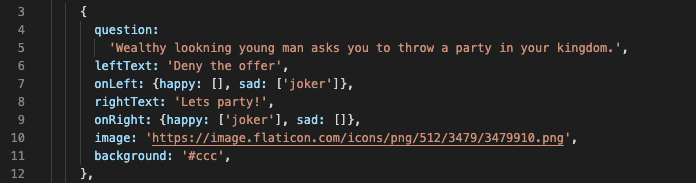
question, leftText and rightText are just strings to be shown during each turn. onLeft and onRight are used in answer handlers: they inform us what are the consequences for each answer. Three possible personas to amuse are Woman, Knight, and Joker. Last things are image and background that determine the final looks of the card.
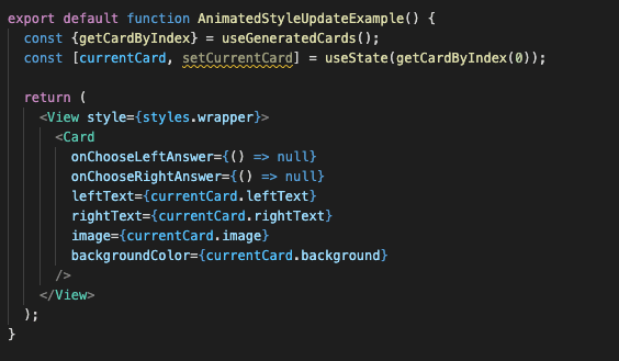
Next, we have Screen.js. This is the main screen of the application. We will hold all necessary components there. For now, we can see that it returns a simple wrapper with a single Card in it.
We don’t have any logic yet so for the time being current card is hardcoded.
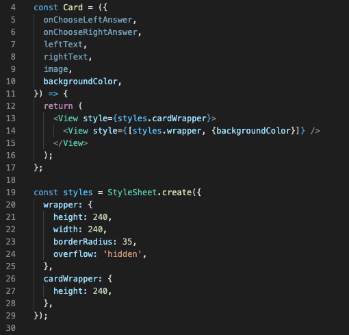
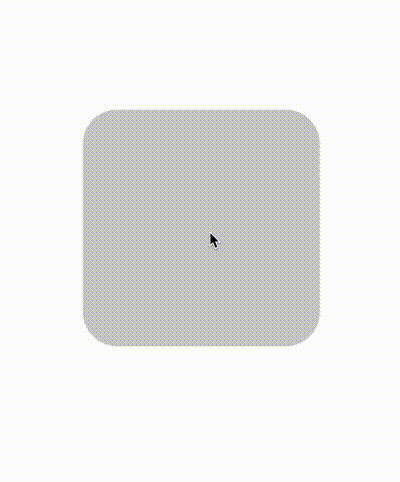
The Card.js itself is a tiny component with a small render that contains a static card preview. I kept Styles simple for clarity.
If you successfully built the project the screen should look like this:

Cool!
We are ready to put some life into that static card of ours!
Gesture handler + Reanimated 2 — iteration-1

Gesture Handler and Reanimated libraries are very closely related. More than often we need to animate some movement initiated by a finger gesture.
That’s also the case here. We want to smoothly follow the finger swiping left and right, while dynamically showing the card content. For cases like this, we can use PanGestureHandler and connect it with a bright new useAnimatedGestureHandler hook introduced in Reanimated 2.
But before we can focus on the gesture handler itself we need to take care of a few things.
First, we need to make sure that we can animate our Card. For that, we simply replace View with powerful Animated.View. It works the same as standard View for the most part but now we can use shared values to set the styles 🎉.
But wait… What are those shared values in the first place?
Let me explain!
Reanimated can’t use any JS variables to animate objects. We need to create specific values to be used in animations. Those are called shared values since they are shared between JS thread and UI thread of the react-native application. (More about UI and JS threads here).
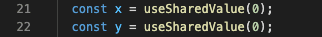
We want to be able to move our card in any direction so we will need two shared values that will move our component in both the x and y axes. The default values for those variables should be 0 since we don’t want any translation applied from the start.
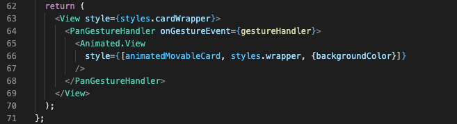
Now we need to edit our render function wrapping brand new Animated.View with PanGestureHandler. This component will track all pan gestures such as swiping.
The final render looks more or less like this:
But wait there’s more!
We have two new elements introduced here that I haven’t mentioned before: gestureHandler and animatedMovableCard.
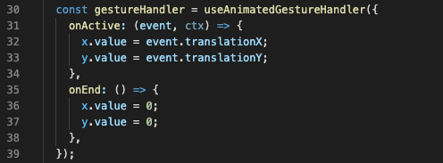
Let’s start with the first one. gestureHandler is constructed with useAnimatedGestureHandler hook imported straight from the Reanimated library. This is a new simple and amazing way to transform your input into shared values. It also can have a separate block of code for every single event like: onStart , onActive and onEnd.
EPIC!
The simplest version of handler for our example would contain only onActive updating x and y based on the position of the finger, and reset the position when the finger is released using onEnd handler.
But it’s not enough. We strive for perfection here! Upgrade!
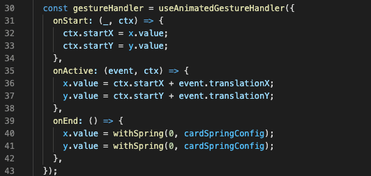
First things first, we need to create onStart where we use ctx object and keep the initial position of the card there. ctx is an object we can use to store any variables between onStart , onActive and onEnd without the need to create new shared value in the component. In our example, saving initial position for x and y value can be quite useful in preventing some strange visual glitches. For example, when the user catches the card in the middle of the move and the card is off-center (eg. when the card is released without choosing any side and should animate back to the original position) we want to add this initial translation to the event translation itself.
That’s exactly what we’re going to do in onActive : add initial ctx values to captured event.translation.
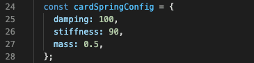
Finally, we want our card to animate smoothly to the starting position. There are a couple of ways to animate some value to a given value. First, I’m going to introduce you to the mechanism that can smoothly animate any variable to a given value using physics: withSpring. Additionally, to make things spicier we can create our own config we want to use in a given spring animation. Pretty!
Now that we have our gesture handler ready, it can start updating the shared values as we pan the finger. However, this won’t result in any movements of the grey box. The only thing left is to map the values to actual Animated.View styles such that to tell how the UI should update when the gesture is happening.
Now, let’s look at the second element I previously mentioned -animatedMovableCard. We can see that it contains a useAnimatedStyle hook. Inside it, we can create any function that can use shared values and return some style object. In our case, we just use x as translateX and y as translateY . That would be enough to make our card move, but to make it prettier we can add some rotationZ such that it rotates a little as it goes away from the center.
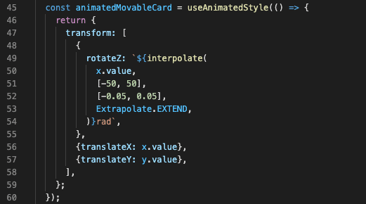
To calculate rotation we can use brand new reimplemented Reanimated 2’s interpolate function. The new one expects 4 arguments: shared value, input table, output value, kind of extrapolation.
In the above example, we want to make interpolation based on x that will be mapped in that way so x.value = 50 would return 0.05 and x.value = -25 would return -0.025 , and thanks to the use of Extrapolate.Extend all values beyond the given range will be extrapolated correctly in a given manner eg. x.value = 750 will be 0.75.
Just a first step
Every journey begins with a single step. In our case, it was a rather giant leap.
During this short time, we covered a lot about Reanimated 2. We got familiar with new shared values, we used new useAnimatedGestureHandler and totally new useAnimatedStyle.
That’s a pretty solid foundation, but it means nothing without exercise! Go into the example and have fun with it! Change things, tweak, break and fix all you want, and stay tuned for the next part where we’re gonna add more awesome things like flip animation, shadows, loading animation, and much more!